

New Release: Network Graph (Limited Release)
Open Measures’ custom built link analysis tool, Network Graph, is now available to the public as a limited beta release.

TLDR
Open Measures is releasing limited access to our Network Graph, the first live point-and-click network graphing and link analysis tool for exploring cross-platform threats. By natively supporting queries across multiple platforms and allowing many connections, the tool turns flat data into complex relations that better explain online threats.
The Network Graph is a cutting-edge tool for commercial, academic and independent researcher use. Open Measures hopes this tool will empower users to visualize malicious multi-platform activity (e.g., state-backed disinformation, astroturfing, coordinated harassment campaigns) and identify the key users behind them.
Introduction
Throughout the last year, the Open Measures community has been busy designing, engineering, and building a novel and innovative product. We began with the premise that online communities are not bound to one platform but instead distribute content across platforms in order to expand their audience and reach.
In order to fully capture the scope of an online community’s activity, there would need to be a tool to represent all of the cross-platform relationships — we’re talking about entities like “users,” “hashtags,” and “links” across every data source that Open Measures actively covers. All of that development has resulted in Open Measures’ Network Graph, a live point-and-click network graphing and multi-platform link analysis tool, which is now available to authenticated users.
Functionality
To collect information on online communities, Open Measures crawls the web by interacting with an API or parsing HTML and then saves the returned data — including individual posts, user profile objects, and channels — as flat files. These raw objects are stored in our back-end and served via Open Measures’ API tooling.
With Network Graph, Open Measures is now able to show that crawled information in a graph structure, representing each data point while visually preserving its relationships with other data points. To fully understand Network Graph’s potential impact and applications, it helps to relate it to how online data relationships are modeled by other applications across web-based industries.
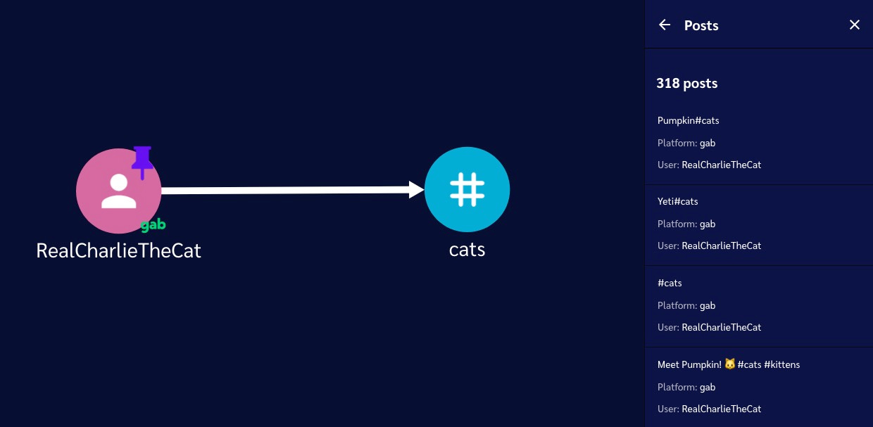
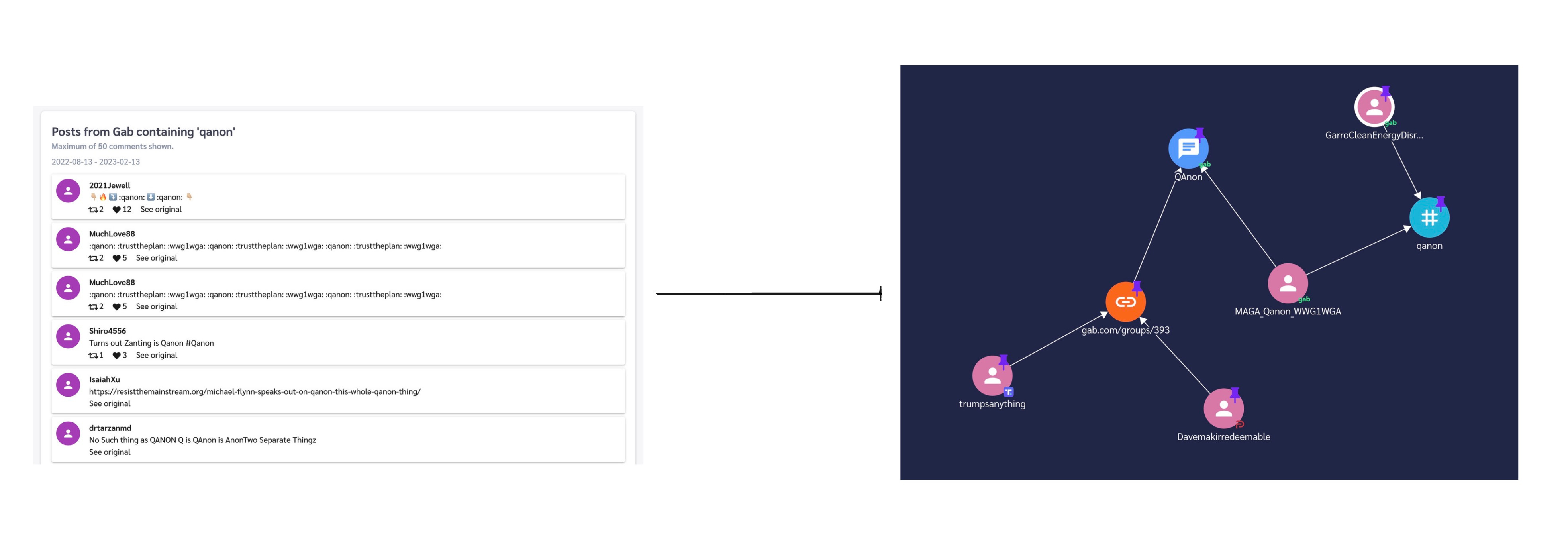
When a user posts a hashtag, there is a relationship created between a user and the hashtag they posted. These kinds of data relationships exist all over the web. Representing them in graph form is considered a backbone functionality for many web applications and technologies (ads and search, for example).
Until now, Open Measures (and the OSINT industry at large) has lacked that capability. As power users of our own analytics tools, our researchers found that pivoting from one data point to another was time consuming and made it difficult to keep track of important information.
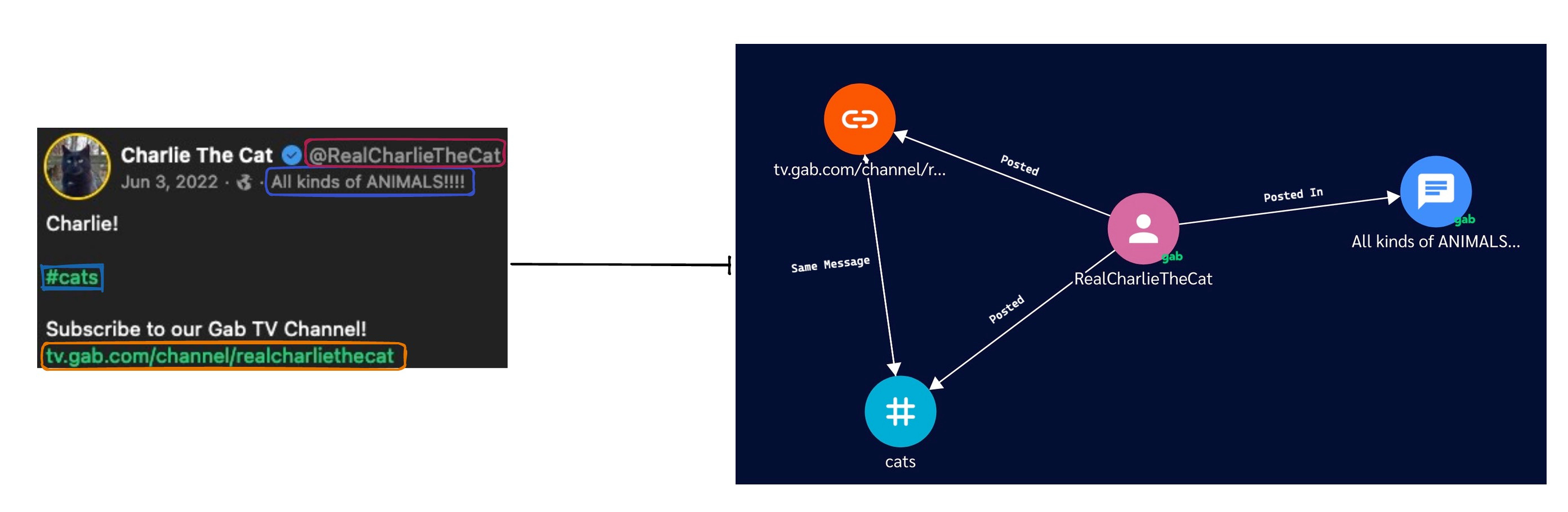
The image above illustrates the exciting new way we can store a Gab post using Network Graph. Usually, Gab posts contain information like the author, the channel it was posted in, and other text-based information within the message, such as a hashtag or a URL.
Previously, this data was both stored and represented as a single flat blob of JSON. Though we’re still storing data the same way, we can now visually represent the relationships between objects within the JSON blob as a networked graph to make browsing and analysis easier.
In Network Graph, we represent each JSON object as a node and each relationship between them as a line, each of which is defined and labeled along its edge. By showing the data this way, we can now visually intuit the following information and context:
“Charlie The Cat” posted in the “All kinds of ANIMALS!!!!” group
“Charlie The Cat” posted a link to their Gab TV channel
“Charlie The Cat” posted the hashtag “#cats”
The hashtag “#cats” and URL to the Gab TV channel appeared in the same post
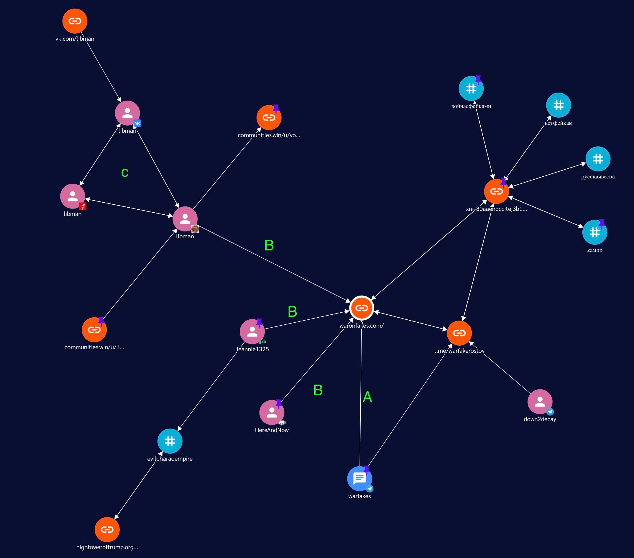
Here’s where things get even more interesting: Network Graph can relate and connect nodes across platforms. In the image above, we traced the relationships between different online actors in a pro-Russia disinformation campaign by beginning with the Telegram channel “WarFakes.”
The result was a very simple but powerful graph, from which we could easily draw some analytical insights:
We can see that the URL “warfakes[.]com” was posted in the Telegram channel “warfakes”
We can see that the URL “warfakes[.]com” was posted by several users in many places including the website LBRY, social media network Gab and subreddit “thedonald”
We see that one user in particular, “libman”, has a profile on additional channels and platforms, including Parler and VK
Specs
To build this tool, we followed several technical specifications and design principles to drive value for our users. As a result, Network Graph is:
Interactive and Customizable
Users can interact with the tool and build their own networks. There is no preset layout.
Dynamic and Live-Updating
Data will be different each time users interact with the tool, because it is always updating. Every time a user runs a pivot, the information provided will be the latest that Open Measures has crawled and stored.
Browser-based
Users don’t need a third-party application, technical expertise, or special hardware to interact with or use Network Graph. All they need is a web browser!
Conclusion
In all, our hope is that Network Graph will make online research and analysis much more efficient, intuitive, and rewarding for all users. We will also be dropping guides, case studies, and other insights we derive from our own investigations using Network Graph, so stay tuned for updates.
Our future plans for Network Graph include:
Releasing an open-source version of the tool, including back-end and front-end code
Deploying and maintaining a limited, public-access version of the tool
Building a community of researchers interested in helping refine this innovative tooling
Please get in touch at info@openmeasures.io if you’d like to be considered for beta testing this release!
Identify online harms with the Open Measures platform.
Organizations use Open Measures every day to track trends related to networks of influence, coordinated harassment campaigns, and state- backed info ops. Click here to book a demo.